Have you ever wondered about the difference between the display values block, flex, inline-flex and inline-block ?
block and inline-block are used to create block-level and inline-level elements respectively. block elements take up the full width available and create a new line, while inline-block elements only take up as much width as needed and allow other elements to sit next to them on the same line.
flex and inline-flex are used to create flexible containers that can adjust the size and position of their child elements. flex containers are block-level elements, while inline-flex containers are inline-level elements that can be placed inline with other elements. The main difference between flex and inline-flex is the direction in which the items are laid out. By default, flex lays items out in a row, while inline-flex lays items out in a line along the inline axis.
What do all the above sentences mean ? I don’t know NotionAi said that. Now let me tell you mine 😊.
Let’s see what their difference is with an example to make it more clear. So, here is what we start the example with.
<div class="wrap">
  <div class="child">1</div>
  <div class="child">2</div>
  <div class="child">3</div>
</div>
<div class="wrap">
  <div class="child">1</div>
  <div class="child">2</div>
  <div class="child">3</div>
</div>
Let’s add some css to spice it up.
.wrap {
  /* display: flex; */
  /* display: inline-flex; */
  /* display: inline-block; */
  border: 3px solid blue;
  padding: 5px;
  margin: 30px;
}

.child {
  border: 2px solid green;
  margin: 5px 2px;
  padding: 3px;
  text-align: center;
}
As you can see from the above html and css
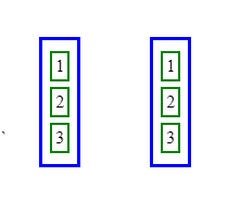
we have two sets of three child div elements wrapped in parent div elements with the class wrap. Now let’s apply different display values to the parent div elements and see how it affects the layout of the child div elements.
block: Thewrapelements will take up the full available width and the child elements will be displayed in a block layout, with each child element taking up the full width of the parent element and appearing on a new line.
Remember: block is the default value for div tag

inline-block: Thewrapelements will only take up as much width as necessary and also will be displayed in inline layout, but the child elements will be displayed in an block layout, with each child element taking up only as much width as necessary.

flex: Thewrapelements will become flexible containers that can adjust the size and position of their child elements. By default, the child elements will be laid out in a row, but thewrapelement is still in block layout.

inline-flex: Thewrapelements will become flexible containers that can adjust the size and position of their child elements, and they will be displayed inline with other elements. By default and also the child elements will be displayed in inline layout too.

This is the basic difference between them. feel free to comment what you think !!
And here is a codepen link for you to play with if you are curious https://codepen.io/dagimg-dot/pen/poQrvaO
#css #flex #webdev #beginners